Sunbeat City
UI/UX Design
UI Designer
Unreal Engine 5
21 developers
2 Months
At the end of the second year of my university course I have been a part of the team developing Sunbeat City, a parkour exploration game. I joined as the sole UI/UX designer, responsible for design and engine implementation.
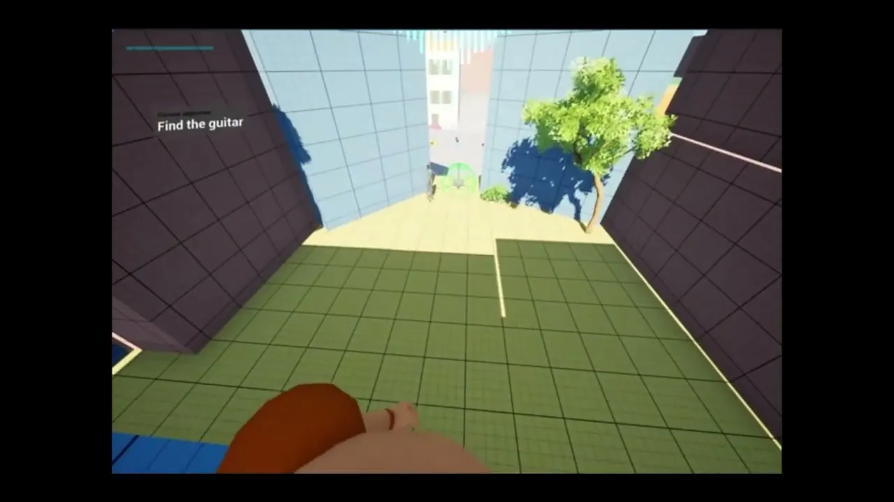
The UI scope included a main menu, settings, credits, an in-game HUD with objective tracking, a diegetic-style pause menu, and a complete secondary flow for a Hide and Seek mode with animated transitions.
I needed to keep the UI minimal and unobtrusive to preserve the flow of parkour gameplay, while still providing clear navigation and feedback across two distinct game modes.
At the end of the second year of my university course I have been a part of the team developing Sunbeat City, a parkour exploration game. I joined as the sole UI/UX designer, responsible for design and engine implementation.
The UI scope included a main menu, settings, credits, an in-game HUD with objective tracking, a diegetic-style pause menu, and a complete secondary flow for a Hide and Seek mode with animated transitions.
I needed to keep the UI minimal and unobtrusive to preserve the flow of parkour gameplay, while still providing clear navigation and feedback across two distinct game modes.
Design Approach
Research
My main references for Sunbeat City were Mirror's Edge Catalyst and Dead Space.
Since both Mirror's Edge games inspired the core gameplay, Catalyst was an obvious starting point. Its HUD hides most elements until needed, mixing diegetic menus, spatial indicators, and meta UI like damage feedback. I was particularly interested in Catalyst's direction indicator and originally wanted to expand on it with diegetic-like navigation arrows similar to how Google Maps implements them in AR view.
Mirror's Edge Catalyst HUD and direction indicator
Mirror's Edge Catalyst HUD and direction indicator

Mirror's Edge Catalyst Diegetic UI
Mirror's Edge Catalyst Diegetic UI
Dead Space showed me how to keep diegetic UI readable during gameplay through clear visual contrast and positioning. I also watched a GDC talk where one of the developers explained their approach: if UI is in front of the character, it stays immersive, but if it's behind the character (like the pause menu), it's allowed to break the fourth wall. I wanted to try this distinction between diegetic and non-diegetic elements.
Dead Space showed me how to keep diegetic UI readable during gameplay through clear visual contrast and positioning. I also watched a GDC talk where one of the developers explained their approach: if UI is in front of the character, it stays immersive, but if it's behind the character (like the pause menu), it's allowed to break the fourth wall. I wanted to try this distinction between diegetic and non-diegetic elements.

Dead Space HUD
Dead Space HUD

Dead Space Floating UI
Dead Space Floating UI
I also looked at The Division 1 & 2, Death Stranding, and Jedi Fallen Order for smaller ideas around map interactions and meta UI treatments.
I also looked at The Division 1 & 2, Death Stranding, and Jedi Fallen Order for smaller ideas around map interactions and meta UI treatments.

The Division 1 Diegetic Map
The Division 1 Diegetic Map
The Division 2 Meta UI
The Division 2 Meta UI
Death Stranding
Death Stranding
Star Wars Jedi: Fallen Order
Star Wars Jedi: Fallen Order
For main menu structure specifically, I looked at newer Persona games and how they use camera transitions between UI screens. Main characters on screen, a simple list of buttons, and camera transitions to different spots in the game world when navigating.
For main menu structure specifically, I looked at newer Persona games and how they use camera transitions between UI screens. Main characters on screen, a simple list of buttons, and camera transitions to different spots in the game world when navigating.

Persona 5 Main Menu
Persona 5 Main Menu
Direction
Dead Space and Mirror's Edge Catalyst's diegetic menus inspired me to pursue a similar style for Sunbeat City, relying on floating digital-like windows. Diegetic UI is notoriously tricky to implement well, but it fit the game's parkour gameplay and gave me a chance to gain experience with an approach I hadn't tried before.
For the main menu, I wanted to adapt Persona's approach. It would bring the attention to the main character of the game, which the players don't see often and it would also make the character artist happy.
Sketches
After establishing my approach, I made quick sketches in Figma based on the features planned for the game. These were less about art direction and more about exploring how to structure each screen and present information to the player.
For the HUD and direction indicator, I sketched versions with varying levels of intrusiveness. We ultimately chose the options that took up the least screen space to preserve the parkour flow.
For the pause and diegetic menus, I explored different layouts and information hierarchies. Some early diegetic menu sketches left too much space for features we already knew wouldn't make it in, which helped me learn to design for the actual scope rather than hypotheticals.
Pause Menu sketches:
For the pause and diegetic menus, I explored different layouts and information hierarchies. Some early diegetic menu sketches left too much space for features we already knew wouldn't make it in, which helped me learn to design for the actual scope rather than hypotheticals.
Pause Menu sketches:


Diegetic Menu Sketches:
Diegetic Menu Sketches:
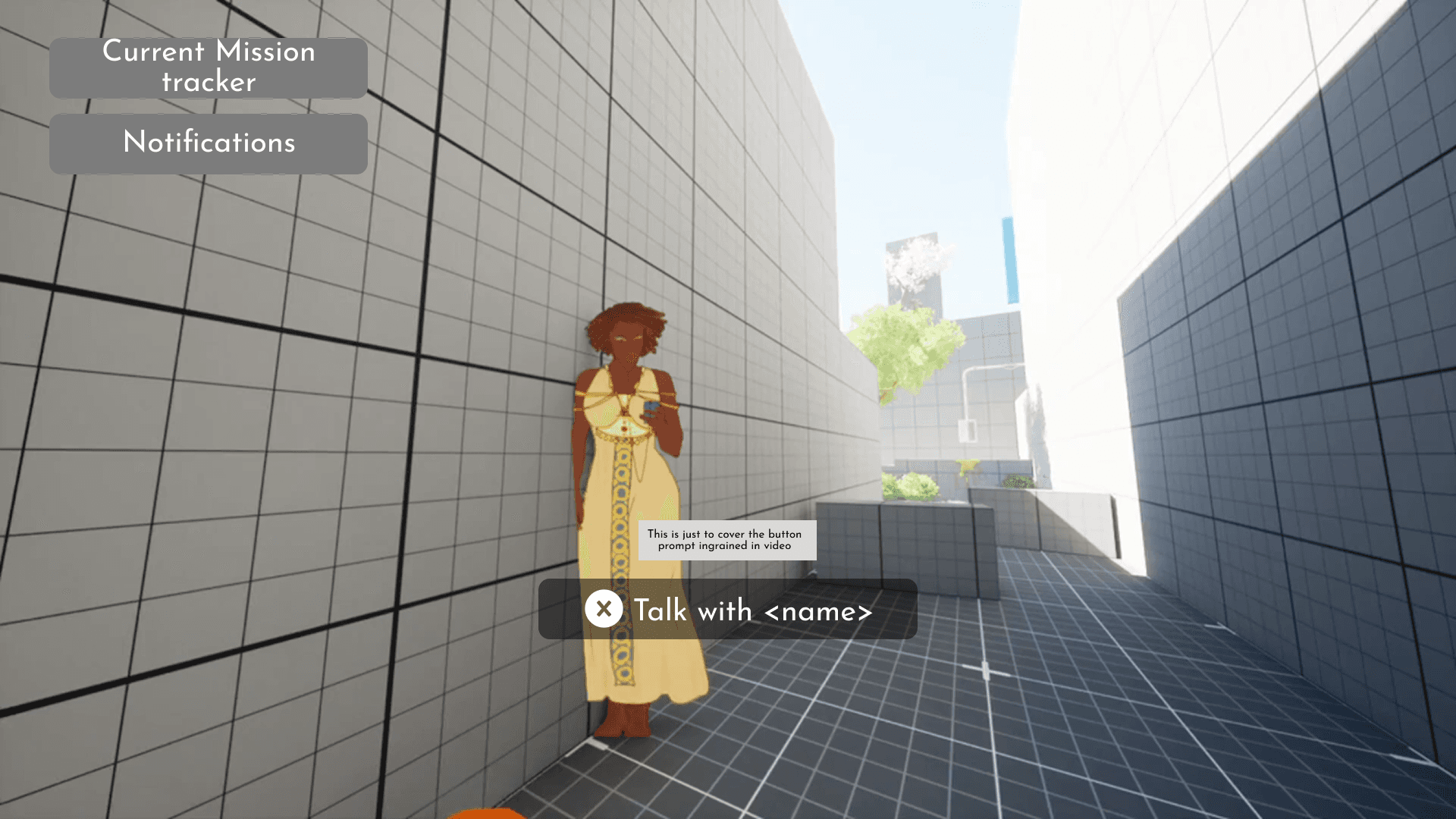
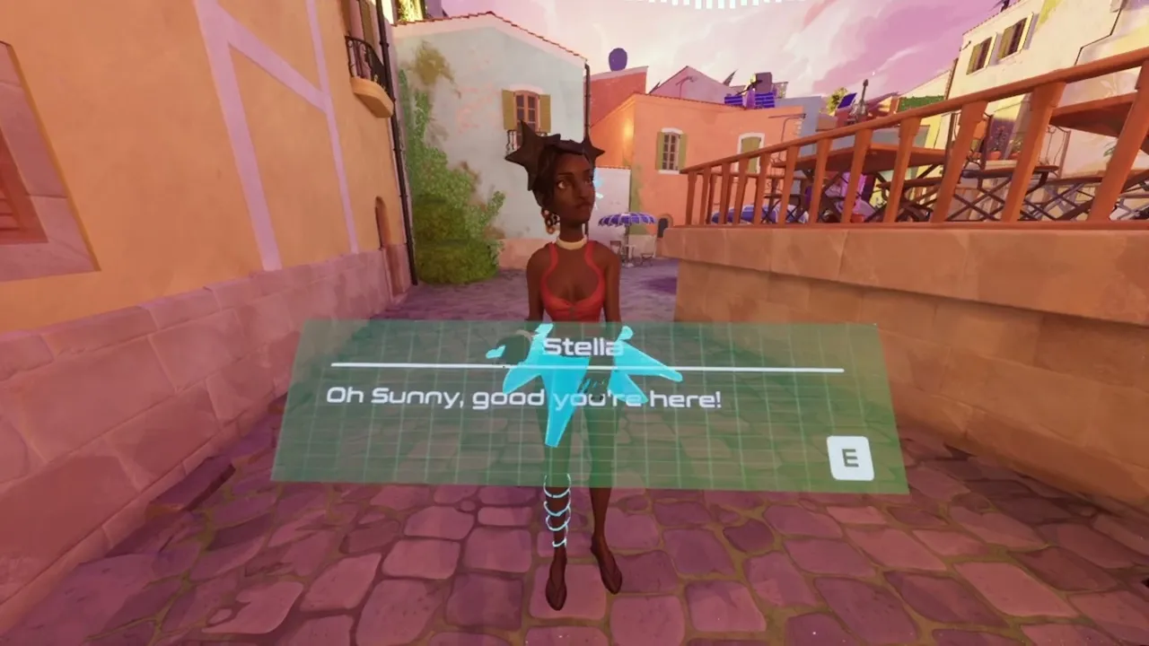
To support the diegetic UI feeling, I made a sketch of NPC interaction, where instead of a normal text box on the bottom of the screen, it would be in a form of a floating UI widget around the actual NPC.
To support the diegetic UI feeling, I made a sketch of NPC interaction, where instead of a normal text box on the bottom of the screen, it would be in a form of a floating UI widget around the actual NPC.

Cut scope and changes
The original vision for Sunbeat City was very ambitious. Player would explore an open-world map, delivering packages to NPCs and shooting newspapers to houses as a collectathon. The UI I planned reflected this: diegetic navigation arrows, a hologram map, challenge tracking, and multiple menu screens.
The original vision for Sunbeat City was very ambitious. Player would explore an open-world map, delivering packages to NPCs and shooting newspapers to houses as a collectathon. The UI I planned reflected this: diegetic navigation arrows, a hologram map, challenge tracking, and multiple menu screens.
That scope didn't survive development. Early playtests revealed that some core mechanics weren't working. The delivery system was hard to convey in first person, and the collectathon required a larger map than the level designers could produce in time. The team shifted to a simpler quest structure: helping an NPC find instruments scattered around a smaller, more linear level.
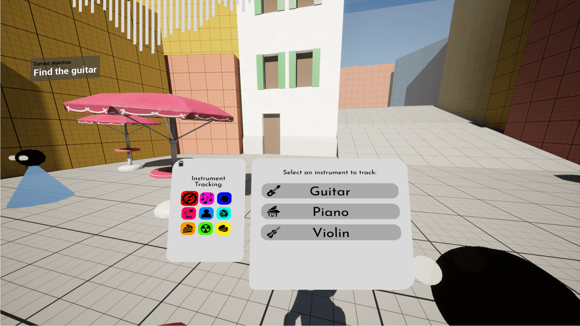
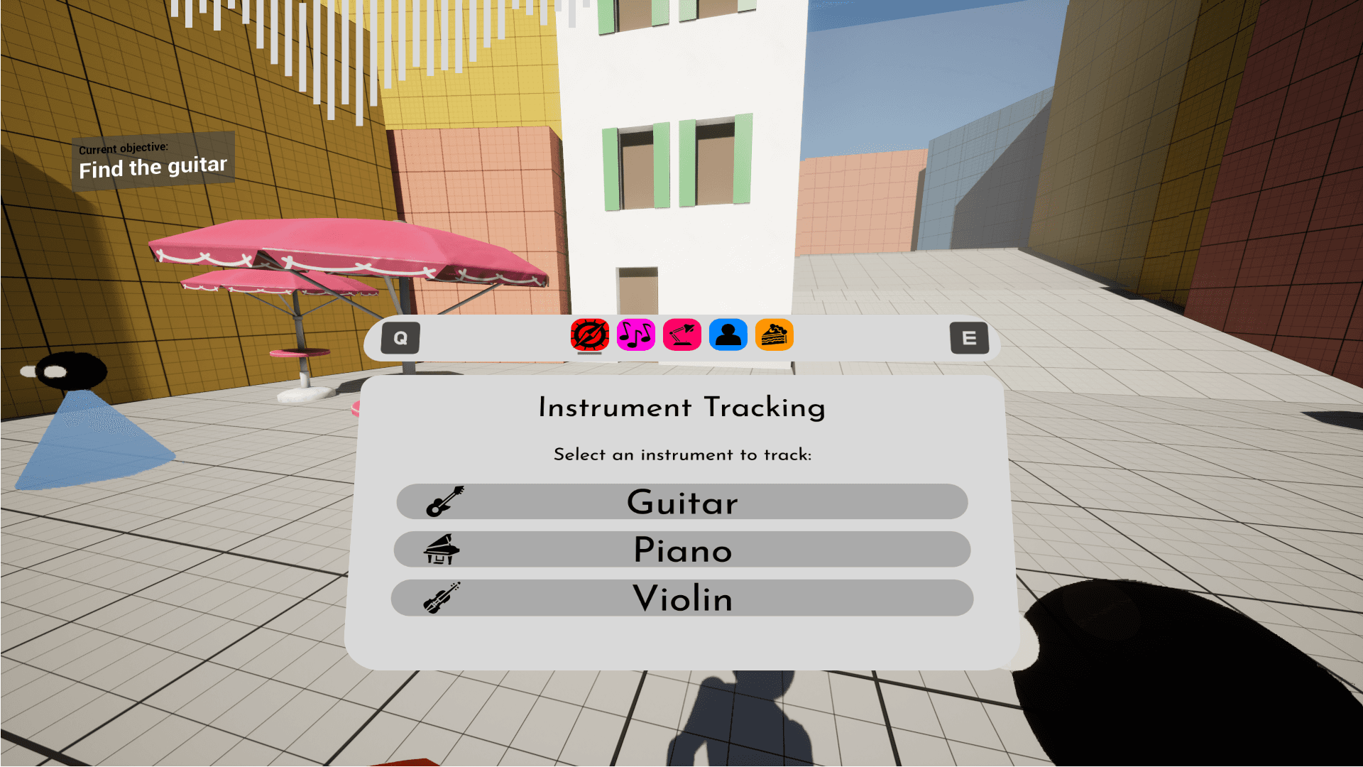
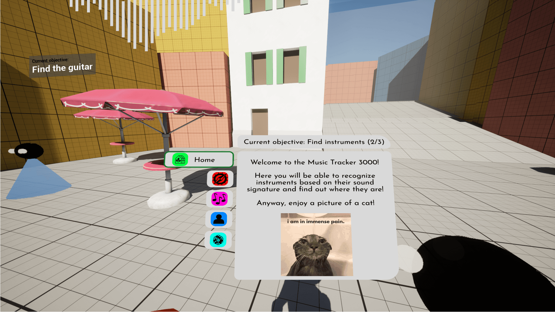
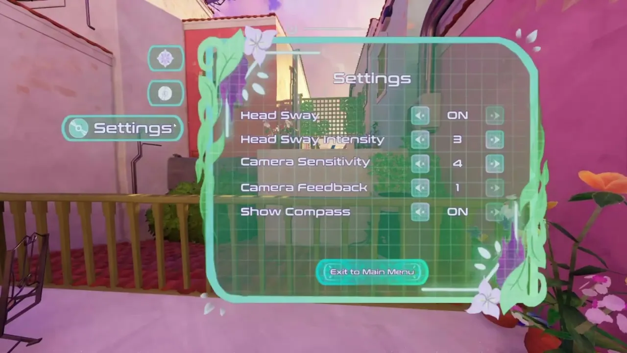
Each change affected my UI plans. The instrument-switching screen I had designed became unnecessary once there wasn't enough content to justify a separate menu. I merged what remained (quest tracking, settings, pause functionality) into a single diegetic menu. The HUD was reduced to a musical compass directing the player to a next instrument and a small objective popup.
That scope didn't survive development. Early playtests revealed that some core mechanics weren't working. The delivery system was hard to convey in first person, and the collectathon required a larger map than the level designers could produce in time. The team shifted to a simpler quest structure: helping an NPC find instruments scattered around a smaller, more linear level.
Each change affected my UI plans. The instrument-switching screen I had designed became unnecessary once there wasn't enough content to justify a separate menu. I merged what remained (quest tracking, settings, pause functionality) into a single diegetic menu. The HUD was reduced to a musical compass directing the player to a next instrument and a small objective popup.
Originally planned
Originally planned
Main Menu, Settings, Credits
Diegetic navigation arrows
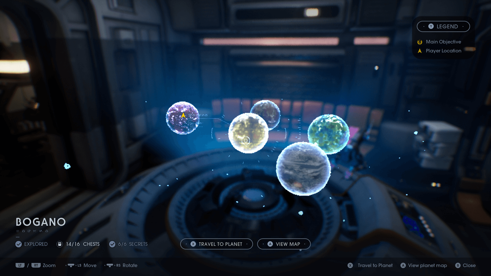
Hologram map
Challenge tracker
Quest log with objective switching
Separate pause menu
Separate diegetic menu
Expanded HUD elements
Main Menu, Settings, Credits
Diegetic navigation arrows
Hologram map
Challenge tracker
Quest log with objective switching
Separate pause menu
Separate diegetic menu
Expanded HUD elements
Final scope
Final scope
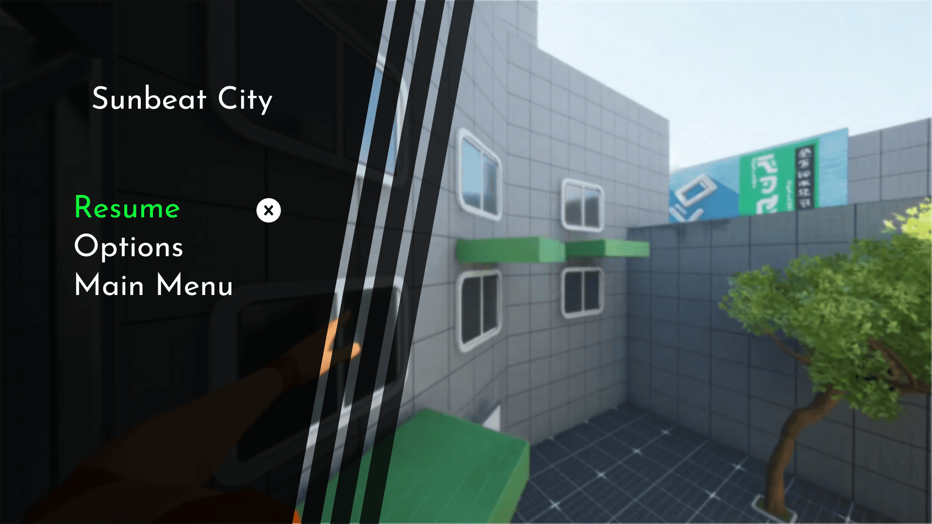
Main Menu, Settings, Credits
Single merged diegetic menu
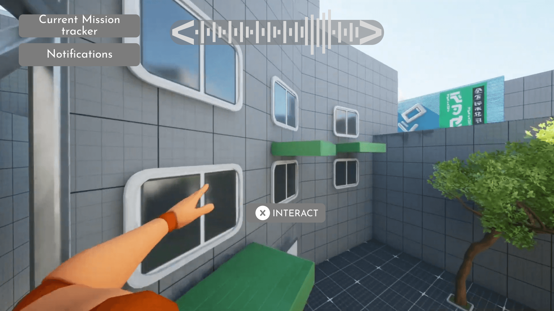
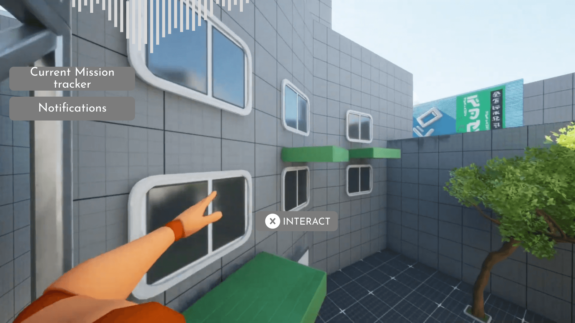
Musical Compass HUD
Objective popup
Hide and Seek UI
Main Menu, Settings, Credits
Single merged diegetic menu
Musical Compass HUD
Objective popup
Hide and Seek UI
The final UI was much smaller than I originally planned. That was disappointing, but it taught me to design flexibly and avoid over-investing in features that might not survive development.
The final UI was much smaller than I originally planned. That was disappointing, but it taught me to design flexibly and avoid over-investing in features that might not survive development.
Engine Implementation
I worked in both Figma and Unreal Engine 5 throughout the project. Below is a breakdown of the final implementations and the thinking behind each.
Since I wanted the HUD to feel diegetic rather than glued to the screen, I added parallax and a subtle curve effect. I built this using a retainer box and two materials in Unreal Engine 5, inspired by how Mirror's Edge and Dead Space make their UI feel like it exists in 3D space around the player.
The diegetic menu is rendered in world space and can be moved by holding right click, which shifts the character's head and menu together. This was a remnant from the original scope where the menu would have felt more fully diegetic. Implementation had some friction: translating mouse input to 3D space in UE5 isn't perfect and required some workarounds.
The diegetic menu is rendered in world space and can be moved by holding right click, which shifts the character's head and menu together. This was a remnant from the original scope where the menu would have felt more fully diegetic. Implementation had some friction: translating mouse input to 3D space in UE5 isn't perfect and required some workarounds.
For the main menu, I adapted the Persona-inspired camera transitions between screens. Looking back, the timing is slower than I'd like. Compared to my reference games, the transitions feel slightly sluggish and could irritate impatient players.
For the main menu, I adapted the Persona-inspired camera transitions between screens. Looking back, the timing is slower than I'd like. Compared to my reference games, the transitions feel slightly sluggish and could irritate impatient players.
I finished the NPC interactions just like I envisioned in the sketches, which is as a hologram floating around the character with their lines shown on it.
I finished the NPC interactions just like I envisioned in the sketches, which is as a hologram floating around the character with their lines shown on it.
Late in production, the team added a Hide and Seek mode where players hide an object, generate a link, and challenge friends to beat their time. I spent significant time on this UI because I wanted the transitions to feel seamless. The postcard and letter animations blur the line between menu and gameplay in a way that's easier to watch than explain.
Late in production, the team added a Hide and Seek mode where players hide an object, generate a link, and challenge friends to beat their time. I spent significant time on this UI because I wanted the transitions to feel seamless. The postcard and letter animations blur the line between menu and gameplay in a way that's easier to watch than explain.
Key Takeaways
We released Sunbeat City on Itch.io at the end of the project and were graded by our lecturers. Feedback during development came mainly from teammates, which helped with iteration but had limits. I didn't have time to conduct proper playtests with outside players, and in hindsight that's something I'd prioritize differently. External feedback would have caught issues like the sluggish menu transitions earlier.
Despite the scope cuts, I'm proud of my attempt at diegetic UI. The final result is far from what I originally envisioned, but the process taught me a lot: how to collaborate with artists on UI direction, what to pay attention to when designing for 3D space, and how to adapt when features get cut around you.
Some things were outside my control. But within my responsibilities, I delivered a complete UI system across two game modes, learned a new implementation pipeline in Unreal Engine 5, and came away with a clearer understanding of how to design flexibly for projects with uncertain scope.