Persona 3 Reload
Persona 3 Reload
Pause Menu Recreation
Pause Menu Recreation
Tech UI Designer
Unreal Engine
Solo
1 Month
During my second year at Breda University of Applied Sciences, I recreated the pause menu from Persona 3 Reload in Unreal Engine 5 to strengthen my UI implementation skills. While both Persona 5 and Persona 3 Reload feature exceptional interface design, I chose P3R for its technical complexity, specifically the dynamic material applied to the main character's clothes and hair, which presented an interesting UI material challenge.
During my second year at Breda University of Applied Sciences, I recreated the pause menu from Persona 3 Reload in Unreal Engine 5 to strengthen my UI implementation skills. While both Persona 5 and Persona 3 Reload feature exceptional interface design, I chose P3R for its technical complexity, specifically the dynamic material applied to the main character's clothes and hair, which presented an interesting UI material challenge.
The Original
////////////////////////////////////////
////////////////////////
/////////////////////

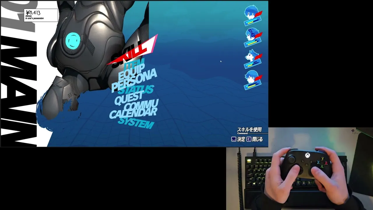
What's on the screen?
Before attempting to recreate the pause menu UI, I broke it down to identify functional components and decorative elements. This told me how I should set up my widget hierarchy and data binding in UMG. The menu includes 4 functional components:
Before attempting to recreate the pause menu UI, I broke it down to identify functional components and decorative elements. This told me how I should set up my widget hierarchy and data binding in UMG. The menu includes 4 functional components:

1. Currency Display - Displays the player's current funds. Would require binding to a game state variable and number formatting with currency symbol.
2. Central Navigation Buttons & Action Bar - 2 main components of the pause menu containing 9 selectable buttons in the middle of the screen and the action bar in the bottom right of the screen (I bundled those 2 together since the Action Bar responds to the selected button). Requires input handling, focus management, and state-based styling for selection/hover states.
3. Party Status Display - Vertical list of four party members portraits with health, SP, and Theurgy bars. Requires data binding to party composition and real-time stat updates.
The remaining screen components are only used for aesthetic purposes. The protagonist floating next to the buttons, animated background effects, and background text on the left side of the screen. While these are crucial for authenticity and visual polish, they don't require game logic integration.
Unfortunately, because of the project's scope I will have to skip some of the components of the screen which are purely cosmetic and add to the higher fidelity of the screen. Those include:
High fidelity 3D Model and Materials
The red petals-like effect in the Pause Menu
Water-like effect on the top right of the screen
Animated background Material
One of the pause menu's most important visual element is its distorted background effect, which creates an underwater-like feel important to Persona 3 Reload's aesthetic. Thanks to the Acerola's video "How Persona Combines 2D and 3D Graphics", I was able to learn how it was originally implemented.
According to the video, a Scene Capture Component captures the game view to a Render Target when the menu opens, which is then processed through custom material shaders. I analysed the shader and broke it down to 3 different materials that work together to achieve the final result.


In the original screenshots you can still see the characters from the game view in the background of the pause menu
In the original screenshots you can still see the characters from the game view in the background of the pause menu
Color Grading filter (MF_BackgroundFilter)
This material function recreates P3R's signature blue-tinted aesthetic through several operations:
Desaturates the captured image to grayscale
Applies posterization to reduce color bands
Layers cyan and teal color gradients to achieve the underwater tone
This material function recreates P3R's signature blue-tinted aesthetic through several operations:
Desaturates the captured image to grayscale
Applies posterization to reduce color bands
Layers cyan and teal color gradients to achieve the underwater tone
Wave Distortion (MF_WaveUpDown)
To simulate liquid motion, I adapted a shader from UI Material Lab that offsets UV coordinates using sine wave functions. The displacement creates vertical undulation across the image, with parameters for:
Wave frequency and amplitude
Animation speed (time-driven)
Directional flow
To simulate liquid motion, I adapted a shader from UI Material Lab that offsets UV coordinates using sine wave functions. The displacement creates vertical undulation across the image, with parameters for:
Wave frequency and amplitude
Animation speed (time-driven)
Directional flow
Master Material
The final material chains both functions together, processing the Render Target input through the color filter first, then applying wave distortion.
The final material chains both functions together, processing the Render Target input through the color filter first, then applying wave distortion.
Result:
When the pause menu is triggered via input, a Blueprint function captures the current frame to a Render Target 2D asset, which is then assigned to a full-screen Image widget using the master material. The material's time parameter drives continuous animation while the menu remains open.
When the pause menu is triggered via input, a Blueprint function captures the current frame to a Render Target 2D asset, which is then assigned to a full-screen Image widget using the master material. The material's time parameter drives continuous animation while the menu remains open.

The character
The pause menu's most interesting element is the protagonist character, which seamlessly blends with the animated background material. Some of the character's clothing and hair adopt the underwater distortion effect while maintaining dimensional depth, creating a striking hybrid of 2D and 3D rendering. This specific shader implementation was one of the reasons why I chose to recreate this menu.
The pause menu's most interesting element is the protagonist character, which seamlessly blends with the animated background material. Some of the character's clothing and hair adopt the underwater distortion effect while maintaining dimensional depth, creating a striking hybrid of 2D and 3D rendering. This specific shader implementation was one of the reasons why I chose to recreate this menu.

Screenshot from the game
Screenshot from the game
Through Acerola's technical breakdown in "How Persona Combines 2D and 3D Graphics" video, I learned that the original game achieves this effect not by using an animated 2D artwork, but by rendering the 3D character model with custom shaders.
I explored multiple solutions before arriving at the final implementation:
Direct Material Application - Applying the background material directly to the character mesh's material slots. This failed because the material was not set up for 3D objects.
Alpha Masking via "Green Screen" - Using a chroma-key style material to create transparency based on color values, allowing the background to show through specific regions. This proved unreliable due to multiple reasons, like lightning affecting the color.
Texture-Based Masking - Painting mask textures directly onto the model's UV layout. While functional, this approach was inflexible and required manual texture work for any model changes.
Each approach had fundamental limitations that prevented accurate replication of the dynamic, shader-driven effect. After iteration, I came up with a different way of approaching this issue - using Unreal Engine's Custom Depth Stencil buffer that would create a mask to isolate specific geometry.
Implementation Process
I created a dedicated Blueprint actor containing the character mesh with a separate hair mesh.
I created a dedicated Blueprint actor containing the character mesh with a separate hair mesh.

The key configuration step was enabling Custom Depth-Stencil Pass in the project rendering settings (disabled by default in UE 5.4).
Each mesh component received a unique stencil value:
Character Body: Stencil Value 1
Hair Mesh: Stencil Value 2
These values act as object IDs that can be read in post-process materials.

The Blueprint contains two Scene Capture Component 2D instances:
Primary Capture - Renders the character with standard materials and lighting, outputting to RenderTarget_Character
Mask Capture - Uses a custom post-process material (PPM_Camera_PostProcess_MainMenu) that reads Custom Depth Stencil values and outputs color-coded masks to RenderTarget_Mask
The post-process material converts stencil IDs into distinct color channels:
Red Channel (255,0,0): Stencil Value 1 (body)
Yellow (255,255,0): Stencil Value 2 (hair)
Black (0,0,0): No stencil (background)
This color-coded mask provides perfect identification of which geometry occupies each screen-space pixel.

Applying the material using the mask
The final composite material (M_Character_Widget_Mat) combines three inputs:
Original character render (RenderTarget_Character)
Stencil mask (RenderTarget_Mask)
Animated background material (from previous section)
The material logic samples the mask's color channels and performs conditional blending:
Yellow regions → Apply background distortion material (hair gets underwater effect)
Red regions → Display original character render (body remains undistorted)
Black regions → Full transparency (empty space)
This approach notably excludes the cyan interior tint visible in P3R's original. That effect would require additional shader work on the character's base materials, which falls outside this masking system's scope.
Result

The resulting texture is assigned to a standard UMG Image widget, creating a real-time animated element that updates every frame (as long as the blueprint is located in the game world).
While effective, this solution also has some considerations:
Requires dual render targets (increased memory overhead)
Custom Depth must be enabled project-wide (minor performance cost)
Stencil values must be manually assigned per mesh component
Despite these constraints, the system successfully replicates the hybrid 2D/3D aesthetic that defines P3R's visual identity.
Stylised Buttons
The pause menu's primary interface consists of nine stylized buttons each navigating to different game subsystems (Skill, Item, Equip, etc.). Recreating this seemingly simple component required solving several complex interaction and rendering challenges while maintaining full cross-input support for mouse, keyboard, and gamepad.
The pause menu's primary interface consists of nine stylized buttons each navigating to different game subsystems (Skill, Item, Equip, etc.). Recreating this seemingly simple component required solving several complex interaction and rendering challenges while maintaining full cross-input support for mouse, keyboard, and gamepad.
Technical Requirements Analysis
Before implementation, I identified seven key behaviors that needed replication:
Cross-Input Compatibility - Seamless switching between mouse hover, keyboard/gamepad navigation, and mixed input modes
Dynamic Button Displacement - Buttons above the selected item shift upward to prevent visual overlap with the selection indicator
Notice how the "Persona" button shifts up and down depending on which button is selected
Notice how the "Persona" button shifts up and down depending on which button is selected
2 Button States - Buttons display animated water textures when idle, transitioning to solid black when selected
Text Color Inversion - The selection cursor converts overlapping black text to red through an additive blend effect
2 Button States - Buttons display animated water textures when idle, transitioning to solid black when selected
Text Color Inversion - The selection cursor converts overlapping black text to red through an additive blend effect

Unhovered
Unhovered

Hovered
Hovered
On-hover Cursor Interpolation - Selection indicator animates between positions rather than teleporting instantly
On-hover Cursor Interpolation - Selection indicator animates between positions rather than teleporting instantly

Video taken from the original game
Video taken from the original game
On-hover cursor Idle Animation - The cursor has continuous subtle motion even when stationary
On-hover cursor Idle Animation - The cursor has continuous subtle motion even when stationary

Video taken from the original game
Video taken from the original game
Entry Animation - Both buttons and cursor play synchronized reveal animations when the menu opens
Entry Animation - Both buttons and cursor play synchronized reveal animations when the menu opens

Video taken from the original game
Video taken from the original game
Implementation
Approach 1: Free-Floating Canvas Layout
My initial implementation placed buttons directly in a Canvas Panel with absolute positioning. This allowed full control over animations using UMG's Sequencer. I could animate button transforms, cursor movement, and hover states independently. The system functioned well across all input devices.

However, this approach had a critical flaw: scalability and maintainability. Each button's three positional states (default, hovered, raised) required hard-coded coordinates on the Canvas panel. Animation sequences referenced Canvas Panel slot positions, which couldn't be accessed within child widget Blueprint Sequencer. Additionally, transforming widgets via Translation doesn't update their collision bounds, creating input detection issues.
Having the buttons be basically hard-coded broke the university project's requirement for modular, data-driven architecture. In a professional context with no anticipated changes, hard-coded positions could be usable, but this project's constraints demanded modularity.
Approach 2: Dynamic Grid Architecture
I restructured the system using a Grid Panel that populates button entries dynamically at runtime. This Widget creates button instances from an array and arranges them.

Grid Panel supports explicit Z-layer, allowing the selection cursor to render between button layers. Vertical Box lacks this capability, forcing cursor elements into separate overlay panels with complex positioning logic.
This architecture solved few problems:
Rather than calculating or manually setting the pixel offsets for raised buttons, I inserted a Spacer widget at grid index [0,0] with variable height. When a button receives focus, Blueprint logic repositions this spacer directly above the selected row, automatically pushing higher buttons upward. The spacing becomes a single adjustable parameter rather than per-button calculations.
CommonUI's focus system can now traverse buttons freely instead of explicit widget references. Controller D-pad and keyboard arrow navigation work automatically.
Buttons instantiate from an array containing text assets, navigation targets, and configuration data. Adding new menu options requires only data table entries, not Blueprint modifications.
Grid Panel Trade-offs
The dynamic layout imposed limitations that required compromises:
Limited Animation Control:
Grid Panel children lose direct access to Sequencer-based animations since their transforms are controlled by the layout system. My planned solution was creating a custom animation subsystem where designers define start/end transforms in data, with Blueprint timelines interpolating between states at runtime. Time constraints prevented full implementation of this feature.
Cursor Interpolation Regression:
The selection cursor now snaps instantly to its target grid cell rather than smoothly interpolating from the previous button's world position. Solving this would require calculating world-space offsets between button centers and manually lerping the cursor's render transform independent of the grid layout, a feature I deprioritized given time limitations.
In production, I would request engineering support to develop a custom Slate widget with built-in animation channels and interpolated repositioning. However, without C++ access or UE Slate experience within the project timeframe, the existing trade-offs were acceptable.
Button Material
Persona 3 Reload uses an unusual technique where button labels exist as pre-rendered texture assets rather than dynamic Text widgets. This pattern made is much easier for me to recreate the buttons properly.
I used the text textures as alpha masks for the button material (M_UI_PauseScreen_Button), which applies the animated water effect over a cyan-blue gradient base. The material uses two functions from UI Material Lab:
MF_UI_LinearTime - Provides continuous time value for animation
MF_UI_Translate - UV offset for scrolling texture effect
This shader closely replicates the original's aesthetic while remaining fully parameterized. It it possible to adjust wave speed, color tints, and distortion intensity without touching the node graph.

On-hover cursor
Video taken from the original game
Video taken from the original game
The cursor's defining feature is its ability to change button text from black to red when overlapping. This initially seemed complex until I recognized it as straightforward additive blending - red (255, 0, 0) material effect adds to underlying black (0, 0, 0) texture, turning it red (0, 0, 0 + 255, 0, 0 = 255, 0, 0).
Replicating the cursor's triangular shape proved challenging, because it changes depending which button is currently selected. I managed to replicate it after I realized that it uses rotation, scaling, and shear to transform.
Implementation:
The cursor consists of 3 Image widgets stacked in the Grid Panel at negative and positive Z-layers (rendering above and beneath buttons):
White base triangle (below the button textures) - Cursor background
1st Red accent triangle (above the button textures) - Turns black text into red, independent position
2nd Red accent triangle (above the button textures) - Turns black text into red, same transform as white triangle
This approach was necessary because in the original the white triangle also created the red accent effect.
The cursor's idle animation uses a Blueprint timeline that scales it up and down, creating subtle breathing motion.
Results
The final system successfully handles mouse, keyboard, and gamepad input with appropriate visual feedback for each interaction mode. The core functionality meets the project's modular architecture requirements while replicating the original's visual identity.
The final system successfully handles mouse, keyboard, and gamepad input with appropriate visual feedback for each interaction mode. The core functionality meets the project's modular architecture requirements while replicating the original's visual identity.
Acknowledged Limitations:
The Grid Panel approach sacrificed animation fluidity and cursor interpolation for architectural flexibility. In a production environment, these would be addressed through:
Custom Slate widget development for layout + animation control
Collaboration with a UI programmer for C++ extensions to UMG
These trade-offs represent real-world engineering decisions. Balancing ideal solutions against project constraints, deadlines, and available technical resources. The resulting system demonstrates functional problem-solving rather than perfect execution, which is often the reality of game development.
Action Bar
The bottom-right action bar provides context-sensitive interaction prompts that update based on menu state and input device. This component displays two types of information: the currently focused menu option (top) and available contextual actions (bottom), giving the player feedback on currently hovered button.
The bottom-right action bar provides context-sensitive interaction prompts that update based on menu state and input device. This component displays two types of information: the currently focused menu option (top) and available contextual actions (bottom), giving the player feedback on currently hovered button.

Screenshot taken from the original game
Screenshot taken from the original game
Technical Requirements and analysis
The action bar demanded several interconnected systems:
Real-Time State Reflection - Top section updates immediately when button focus changes, displaying the action associated with the selected menu item
Context-Aware Action Display - Bottom section shows screen-specific commands
Input Device Responsiveness - Button icons dynamically swap between keyboard glyphs and gamepad symbols based on the active input method
Clickable Interaction - Each action functions additionally as a clickable button, not just visual feedback
Modular Data Flow - The action bar itself shouldn't store any hardcoded content; all text and icons should be provided by parent systems
Implementation
I initially attempted to use Unreal's CommonUI Action Bar widget, which provides built-in input icon routing and action binding. However I found it hard to work with and not have all the features I needed, so I decided to build a custom Blueprint-based widget.
Visual Construction
Consistent with the button system, the action bar uses pre-rendered text textures rather than dynamic Text widgets. Each entry requires two assets:
Text label texture - The actual readable text
Background glow texture - A subtle highlight effect for readability against busy backgrounds
While this approach didn't simplify development (as with the buttons' masking), it ensures visual consistency with the original design and maintains the stylized glow effect that would be difficult to replicate with font rendering and shadow parameters.
Additionally, the icon prompts at the lower section are managed by the CommonUI, so they are always matching the input method of the player.
Data Flow and Modularity
The upper portion displays the primary action triggered by the confirming the input. Rather than maintaining an internal database of menu options, the action bar receives this data directly from the currently focused button widget through event dispatchers.
Once a button gains focus, it dispatches the stored textures to the Action Bar, and the Action Bar immediately applies it to the top section. This keeps the Action Bar generic and re-usable.
The lower portion shows screen-level commands. This data is provided by the parent screen Blueprint (in this case, the Pause Menu widget), which defines:
Number of action entries
Input binding names (for icon retrieval)
Associated text textures
Callback functions for each action

The action bar exposes a "Update Action Bar Buttons" function that accepts an array of action data structs, allowing screens to configure it at runtime. This enables dynamic updates when menu context changes (e.g., entering/exiting submenus).
Event Binding Architecture
Making the action bar clickable required dynamic event binding. When the bottom section populates its button widgets, each is bound to a delegate provided by the parent screen.
This pattern allows the parent screen to define behavior while the action bar handles presentation. For example, the first button's callback triggers the click of the current button, but the action bar doesn't need to understand menu state management, it simply invokes the delegate when clicked.
Supporting widgets
Beyond the major widgets, several smaller widgets contribute essential functionality and visual cohesion to the pause menu. While individually less complex than the navigation or action bar systems, these components add to the Pause Menu's functionality.
Beyond the major widgets, several smaller widgets contribute essential functionality and visual cohesion to the pause menu. While individually less complex than the navigation or action bar systems, these components add to the Pause Menu's functionality.
Screenshot taken from the original game
Screenshot taken from the original game
Money Widget
The top-left money widget shows the player's current funds. What appears to be a simple number display shows an unusual implementation.
The top-left money widget shows the player's current funds. What appears to be a simple number display shows an unusual implementation.

Consistent with P3R's texture-heavy UI philosophy, even individual digits are rendered as image assets rather than font glyphs. This means displaying "¥8413" requires dynamically instantiating and arranging four separate Image widgets, each loading the appropriate numeral texture.
I wrote a blueprint that would break down the current money value into separate digits and spawns the images with their appropriate images in order.
Party Status Display

The party status display on the top right side of the screen is showing the current status of the party. I created one version of it and repeated it 4 times in the Pause Menu.
The HP, SP, and Theurgy bars are textures that are being filled by a simple material depending on the values in the game.
The Theurgy gauge in the original features a unique animated texture with flowing energy effects. Due to project time constraints, I used a solid color fill material instead. I simply did not have enough time to finish everything I would have wanted.
Background Text
Screenshot taken from the original game
Screenshot taken from the original game

In the background of the Pause Menu, there is a simple text that changes based on which button is currently selected. I could not find the textures for this piece, so it's probably an actual text field. I made the assets on my own in my project, which look close enough.
In the background of the Pause Menu, there is a simple text that changes based on which button is currently selected. I could not find the textures for this piece, so it's probably an actual text field. I made the assets on my own in my project, which look close enough.
Conclusions and reflections
This recreation of Persona 3 Reload's pause menu served as an intensive exploration of UI implementation challenges that extend far beyond visual replication. Over the course of this project, I encountered and solved problems across multiple technical problems: material shader development, input system architecture, widget communication patterns, and performance optimization.
Key Takeaways
The project pushed my material shader knowledge significantly. Creating the underwater distortion effect required understanding UV manipulation, render targets, and post-process materials at a deeper level than previous work. The character masking system, in particular, taught me the value of the Custom Depth Stencil buffer as a powerful tool for selective rendering effects.
The navigation system's change from hard-coded Canvas layouts to dynamic Grid architecture showed a critical part of the game development: initial implementations often prioritize immediate functionality over long-term maintainability. Recognizing when to refactor, even under time pressure, prevents technical debt from compounding.