Monster Hunter: World
UI Recreation
UI Designer/Artist
Figma
Solo
2 Weeks
As a part of my UI/UX studies, I decided to recreate some of the in-game UI of Monster Hunter: World in Figma.
With this exercise I focused on recreating both the UI and the UX of Monster Hunter: World to make the screens as similar to the actual game as possible. I tried my best at capturing that distinctive Monster Hunter: World vibes by recreating the UI art as closely as possible.
As a part of my UI/UX studies, I decided to recreate some of the in-game UI of Monster Hunter: World in Figma.
With this exercise I focused on recreating both the UI and the UX of Monster Hunter: World to make the screens as similar to the actual game as possible. I tried my best at capturing that distinctive Monster Hunter: World vibes by recreating the UI art as closely as possible.
Preparation
Research
Before opening Figma, I gathered all the screenshots and reference material I needed. I mainly focused on the Pause Menu and on how Monster Hunter: World handles sub-menus.
Based on this research, I put together a small UI art guide covering things like fonts, colors, textures, and highlight effects to help me match the game's style. You can find it in Figma below:
Before opening Figma, I gathered all the screenshots and reference material I needed. I mainly focused on the Pause Menu and on how Monster Hunter: World handles sub-menus.
Based on this research, I put together a small UI art guide covering things like fonts, colors, textures, and highlight effects to help me match the game's style. You can find it in Figma below:
Monster Hunter: World UI Guide
Picking the Screens
I decided to recreate the Pause Menu and design two new screens on top of it. I wanted ideas that were fun but still plausible within the game, and settled on an insurance screen and a recipe page. Both seemed like interesting screens to ideate on.
I also considered the notebook-themed menus, but I decided they were too complex to complete within the 2-week deadline I set for myself.
I decided to recreate the Pause Menu and design two new screens on top of it. I wanted ideas that were fun but still plausible within the game, and settled on an insurance screen and a recipe page. Both seemed like interesting screens to ideate on.
I also considered the notebook-themed menus, but I decided they were too complex to complete within the 2-week deadline I set for myself.
Screen Recreations
Pause Menu
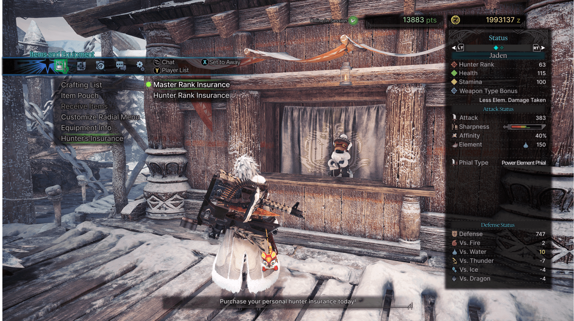
Since the other two screens build on the Pause Menu, I started there. I broke the screen down into specific parts (the Button Menu, Stat Menu, etc.) and worked on them one at a time.
For each component, I worked from back to front: background first, then icons and text, then the highlight effect. Layering it this way helped me get the components very close to the original. I recreated almost everything, from finding the closest font to the original to adding a slight layer blur over each component to soften its edges.
The final Pause Menu recreation can be seen below:
Since the other two screens build on the Pause Menu, I started there. I broke the screen down into specific parts (the Button Menu, Stat Menu, etc.) and worked on them one at a time.
For each component, I worked from back to front: background first, then icons and text, then the highlight effect. Layering it this way helped me get the components very close to the original. I recreated almost everything, from finding the closest font to the original to adding a slight layer blur over each component to soften its edges.
The final Pause Menu recreation can be seen below:
Original screenshot source: GameUIDatabase
Insurance Screen
Building on the Pause Menu components and the rules from my UI art guide, I designed the Insurance Screen. I imagined insurance as a mechanic that lets the Hunter pay a small upfront fee to reduce their losses if they fail a hunt. The player picks one of four options, each offering different bonuses.
In the full game, this setting could also be changed right before a hunt, but I limited the scope to this one screen to stay within my deadline.
Lo-fi and final versions of the Insurance Screen can be seen below:
Building on the Pause Menu components and the rules from my UI art guide, I designed the Insurance Screen. I imagined insurance as a mechanic that lets the Hunter pay a small upfront fee to reduce their losses if they fail a hunt. The player picks one of four options, each offering different bonuses.
In the full game, this setting could also be changed right before a hunt, but I limited the scope to this one screen to stay within my deadline.
Lo-fi and final versions of the Insurance Screen can be seen below:
Recipe Screen
The second screen is a recipe list that gives players real-world recipes for the dishes served to the Hunter in-game.
The flow works across three levels:
Recipe list: A long list of dishes, which the player can filter to show either sweet or savoury recipes.
Recipe overview: Hovering over a dish opens a sub-menu with an image of the dish and its ingredient list. Once confirmed, it is possible to switch between pages of the ingredient list. This was needed, since most recipes have multiple parts.
Cooking steps: Selecting a part opens another sub-menu with the steps for that part, which the player can scroll through.
The player can return to the previous level at any time with the "Back" button.
Lo-fi and final versions of the Recipe Screen can be seen below:
The second screen is a recipe list that gives players real-world recipes for the dishes served to the Hunter in-game.
The flow works across three levels:
Recipe list: A long list of dishes, which the player can filter to show either sweet or savoury recipes.
Recipe overview: Hovering over a dish opens a sub-menu with an image of the dish and its ingredient list. Once confirmed, it is possible to switch between pages of the ingredient list. This was needed, since most recipes have multiple parts.
Cooking steps: Selecting a part opens another sub-menu with the steps for that part, which the player can scroll through.
The player can return to the previous level at any time with the "Back" button.
Lo-fi and final versions of the Recipe Screen can be seen below:
Key Takeaways
This exercise noticeably improved my UI art and graphic design skills. UI art isn't my main focus, but the recreation taught me a few practical techniques I can build on.
The biggest lessons came from the smallest details. Slightly blurring the text so it isn't perfectly sharp makes it blend into the art style instead of standing out from it. Details like this showed me how much care and attention went into making Monster Hunter: World's UI stand out the way it does.
This exercise noticeably improved my UI art and graphic design skills. UI art isn't my main focus, but the recreation taught me a few practical techniques I can build on.
The biggest lessons came from the smallest details. Slightly blurring the text so it isn't perfectly sharp makes it blend into the art style instead of standing out from it. Details like this showed me how much care and attention went into making Monster Hunter: World's UI stand out the way it does.